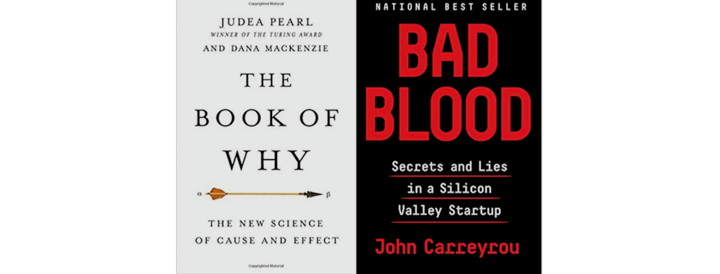
###Judea Pearl’s The Book of Why: The New Science of Cause and Effect
I was honestly surprised by how much I liked this book. It covers Pearl’s new work on causal diagrams, directed graphs where each node represents a variable and edges point in the direction of the causal effect. His claim is that these graphs make previously “squishy” arguments about identification mathematically robust, simplify many hard-to-explain causal concepts, and will be useful in building strong artificial intelligence because the graphs are machine-readable, unlike other causal identifying assumptions.
For a little bit of background, usually when a researcher makes a causal claim about observational data (not a randomized control trial), they also specify some assumptions about how the variables need to relate to one another for the result to be causal not just correlational. Often these are justified by subject area knowledge or, when possible, other data analyses. Pearl’s causal diagrams, he claims, are easier to understand and interpret than written out descriptions of the model and assumptions.
What I found particularly entertaining in this book were the shots Pearl took at other practitioners, notably statisticians and economists, who he claims have thrown up their hands and abandoned causation as too difficult to prove. I can certainly sympathize with this view, particularly among economists, who I think are often too reluctant to make causal claims without randomized experiments.
However, throughout the book I constantly expected the next chapter to be about how to draw these diagrams. The examples he used were often related to smoking and lung cancer, where we have a very strong existing understanding of the causal mechanisms. But the diagrams seem much less helpful when you are not certain about which edges exist (and in which direction), or even what variables should be represented. The answer might delve too deep into epistemology (how do we “know” an empirical relationship exists), but it seems like a central question to the utility of these diagrams. The data analyst might rely on experts for the diagram, but I think many of the issues in causal inference come not from the ability to explain the causal assumptions but rather in justifying those assumptions.
Of course if an expert hands you a list of relationships that are accepted conventional wisdom in the field, a data analyst could do the causal analysis. But that never really happens outside of a few contrived subject areas. Particularly in social sciences, almost no relationships are accepted as true. Social structures even change over time, so the fact that some correlation held in the past is not always a good justification for using it in a causal diagram about current trends. To me, its always seemed easiest to make causal inferences when you have a strong understanding of the subject area. Going from a list of beliefs to a directed graph might help formalizing the mathematical definitions of cause and effect, but it really doesn’t seem like it would help much in practice because the hard part is getting that list and quantifying uncertainty about the list.
An area where I do understand how the diagrams are useful is when Pearl discussed how to teach causation to machines. A list of beliefs is quite hard for a computer to understand, but a directed graph referring to how each variable causes changes in others does sound very machine-interpret-able. The problem of generating the list still seems hard, but the notion of how do you tell a computer that X causes Y and not the reverse was pretty interesting.
John Carreyrou’s Bad Blood: The Theranos Story
This was a really fascinating rundown of how a well-regarded start-up collapsed. The short of it is that the promises made by the founder and CEO Elizabeth Holmes about being able to run hundreds of medical tests on a single drop of blood were lies. Employees who raised concerns that the tests were not accurate or that the product just didn’t work were told that they weren’t ``team players,’’ fired, and forced to sign non-disclosure agreements. Through a mixture of deceit (showing “live” demos that were actually recordings of results), strong branding, and an idea that, if it had worked, would genuinely have been revolutionary, she convinced senior executives and officials at a variety of institutions to buy into her company and her personally. When results did not look good or deadlines were not met, the executives made excuses or accepted the delays because they believed in the grand vision of revolutionizing health care.
The story is well chronicled in the book and the popular press, so I’ll just highlight one of my takeaways that I haven’t seen discussed elsewhere. A lot of the information John Carreyrou gathered would have been impossible without Theranos hiring some wealthy and well-connected Stanford graduates. The former employees who spoke to Carreyrou had to bear significant legal risk. Theranos had paid David Boise, one of the most feared attorneys in the country, with company shares and his law firm vigorously enforced the NDAs employees had signed. They hired investigators to follow ex-employees who they suspected were talking to journalists. Theranos both threatened to sue and actually sued potential whistleblowers. One of Carreyrou’s main informants was a Stanford graduate who had wealthy parents and was the grandson of a former Secretary of State. He (his parents) had the financial resources to weather the legal attacks until the story broke, while other whistleblowers (quite rationally) backed out after threats of litigation.
Existing whistleblower statutes were certainly not enough to protect the former Theranos employees who had concerns. It should not be only privileged white men who can take the risk of reporting the companies that they work for.

